Design system
Design system
Design System Rebuild

I led the rebuild of Liberty’s Design System following a full migration from Adobe XD to Figma, powering 20,000+ pages on libertylondon.com. The new system prioritised simplicity, scalability, and seamless designer-developer collaboration.
It established a future-ready, inclusive foundation for digital growth.
Role
Role
Lead Design System Designer
Company
Company
Liberty London
Skills
Skills
Design System Architecture
Component Library Development
Design Token Management
Guidelines Documentation
Accessibility Compliance
Timeline
Timeline
Jan 2024 - Ongoing
Challenge

When the team shifted from Adobe XD to Figma in early 2024, the old design system proved too outdated and unusable.
For our team of 5 designers and 3 developers, a newly structured system became critical. Legacy components lacked structure, blocked efficient design, and slowed collaboration between design and development.
Strategic Objectives
To ensure the new design system met real needs across the organisation, I worked closely with stakeholders, designers, and developers from the start. I ran collaborative workshops to align on goals, audited legacy components, and established clear design principles focused on scalability, accessibility, and consistency.
Goals
Build a scalable design system in Figma to improve consistency, streamline designer–developer collaboration, and prepare for future tokenisation and a more accessible, modern UX.
Phase 1
Audit & Analysis
I reviewed all legacy Adobe XD files and frontend code. Key issues included duplicated components, visual inconsistencies, and accessibility gaps that hindered efficiency and scalability.

Legacy System Audit (Partial Summary)

Legacy System Audit (Annotated Highlights)

Legacy System Audit (Annotated Highlights)
Legacy System Audit (Partial Summary)
Legacy System Audit (Annotated Highlights)
Legacy System Audit (Annotated Highlights)
Legacy System Audit (Partial Summary)
Legacy System Audit (Annotated Highlights)
Legacy System Audit (Annotated Highlights)
Legacy System Audit (Partial Summary)
Legacy System Audit (Annotated Highlights)
Legacy System Audit (Annotated Highlights)
Legacy System Audit (Partial Summary)
Legacy System Audit (Annotated Highlights)
Legacy System Audit (Annotated Highlights)
Legacy System Audit (Partial Summary)
Legacy System Audit (Annotated Highlights)
Legacy System Audit (Annotated Highlights)
Legacy System Audit (Partial Summary)
Legacy System Audit (Annotated Highlights)
Legacy System Audit (Annotated Highlights)
Legacy System Audit (Partial Summary)
Legacy System Audit (Annotated Highlights)
Legacy System Audit (Annotated Highlights)
Legacy System Audit (Partial Summary)
Legacy System Audit (Annotated Highlights)
Legacy System Audit (Annotated Highlights)
Legacy System Audit (Partial Summary)
Legacy System Audit (Annotated Highlights)
Legacy System Audit (Annotated Highlights)
Legacy System Audit (Partial Summary)
Legacy System Audit (Annotated Highlights)
Legacy System Audit (Annotated Highlights)
Legacy System Audit (Partial Summary)
Legacy System Audit (Annotated Highlights)
Legacy System Audit (Annotated Highlights)
Phase 2
Foundation Building
I created a new file structure in Figma to establish clarity, reuse, and scalability. This included atomic organisation, manual design token setup, and foundational decisions around colour, typography, and component structure.

System Structure & Hierarchy
I established a shared system structure using atomic design principles, improving team-wide clarity and reuse.
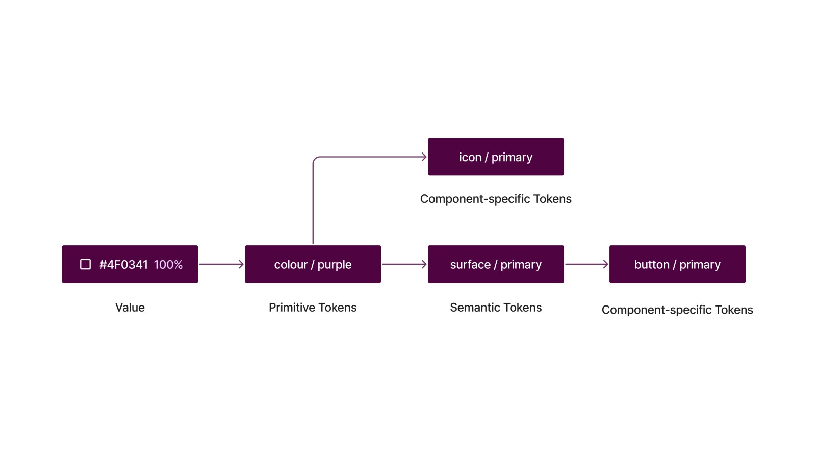
Design Token Architecture
Design tokens were mapped from raw values to semantic usage across components, laying the groundwork for scalability and future code implementation

Token Implementation in Figma
To ensure consistency across the UI, tokens were created and mapped in Figma for colours, surfaces, borders, and text styles.
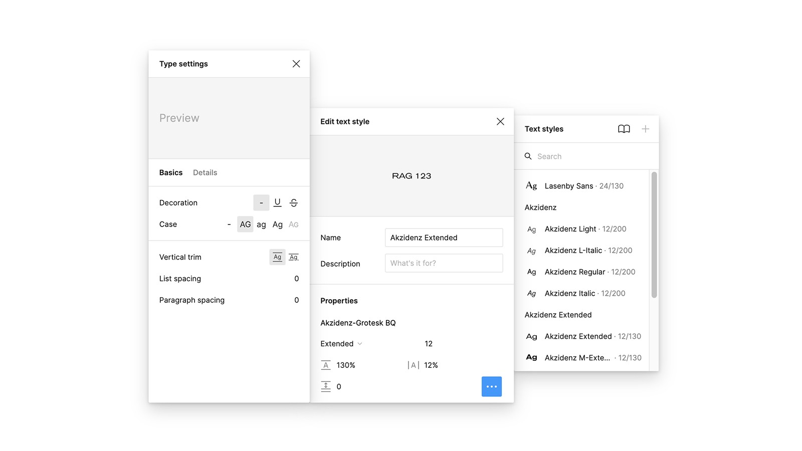
Typography Foundations
The type system was defined using Liberty fonts across headings, body, and UI elements, with carefully controlled line height, spacing, and casing to support clarity and brand alignment.
System Structure & Hierarchy
I established a shared system structure using atomic design principles, improving team-wide clarity and reuse.
Design Token Architecture
Design tokens were mapped from raw values to semantic usage across components, laying the groundwork for scalability and future code implementation
Token Implementation in Figma
To ensure consistency across the UI, tokens were created and mapped in Figma for colours, surfaces, borders, and text styles.
Typography Foundations
The type system was defined using Liberty fonts across headings, body, and UI elements, with carefully controlled line height, spacing, and casing to support clarity and brand alignment.
Phase 3
Component Creation
I built a robust component library in Figma using Auto Layout, variants, and interaction states. Accessibility, responsive behaviour, and developer-ready logic were embedded throughout to ensure long-term scalability.

Reusable Component Library
A scalable library of 60+ reusable UI components, structured with variants and accessibility baked in to support consistent interfaces across flows.
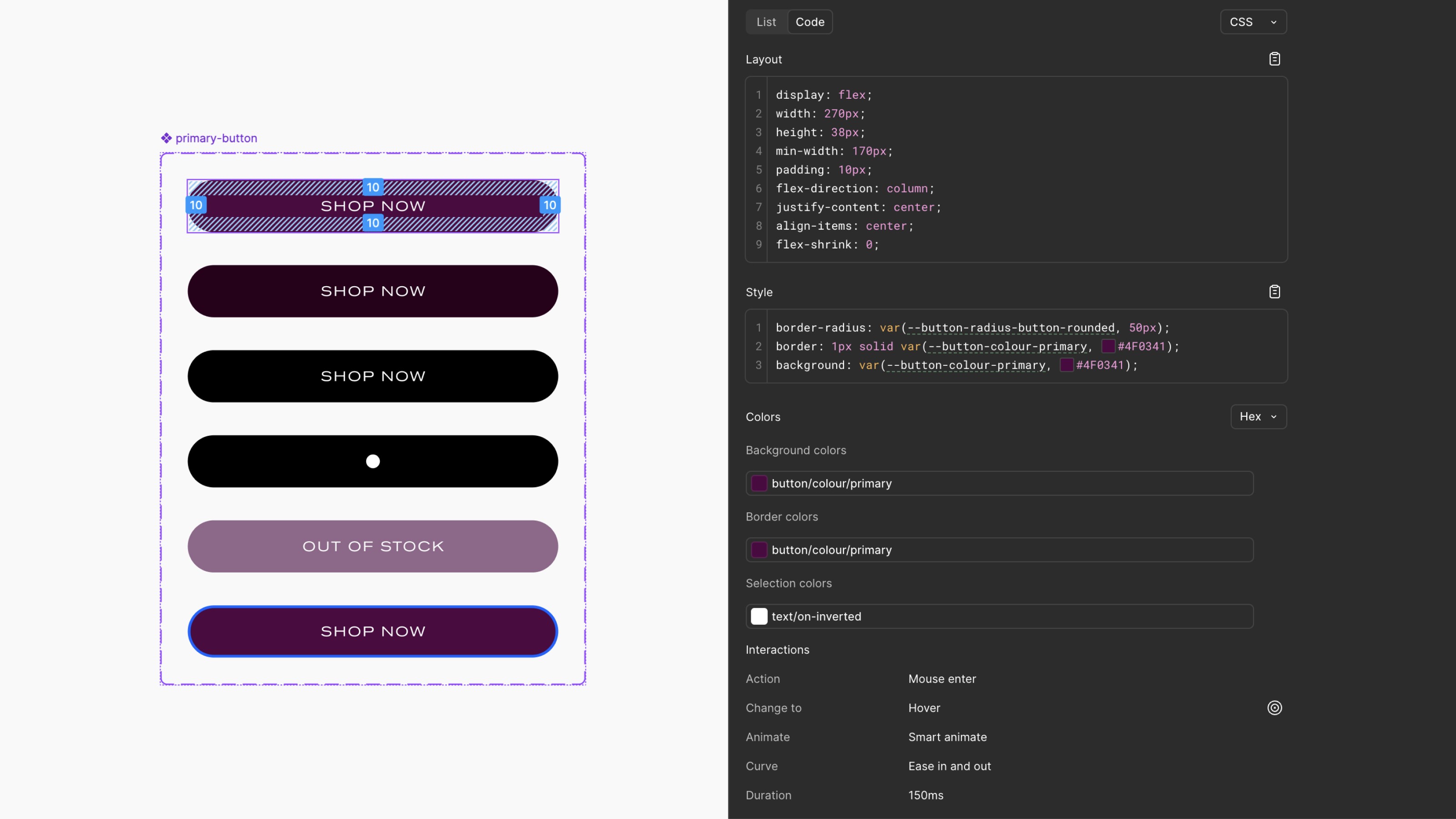
Variants & Properties
Core components are structured with variants to handle size, type, and state. Properties make interaction logic visible and intuitive, streamlining handoff for developers and ensuring predictable behaviour.
Component Interactions
Interactive states such as hover, focus, and selection were prototyped in Figma to show behaviour clearly. Micro-interactions and transitions help communicate intent and improve UX clarity.

Accessibility
Components were designed with accessibility in mind from the start, including visible focus indicators, keyboard navigation, and high-contrast messaging. All new colours and labels meet or exceed WCAG AAA.
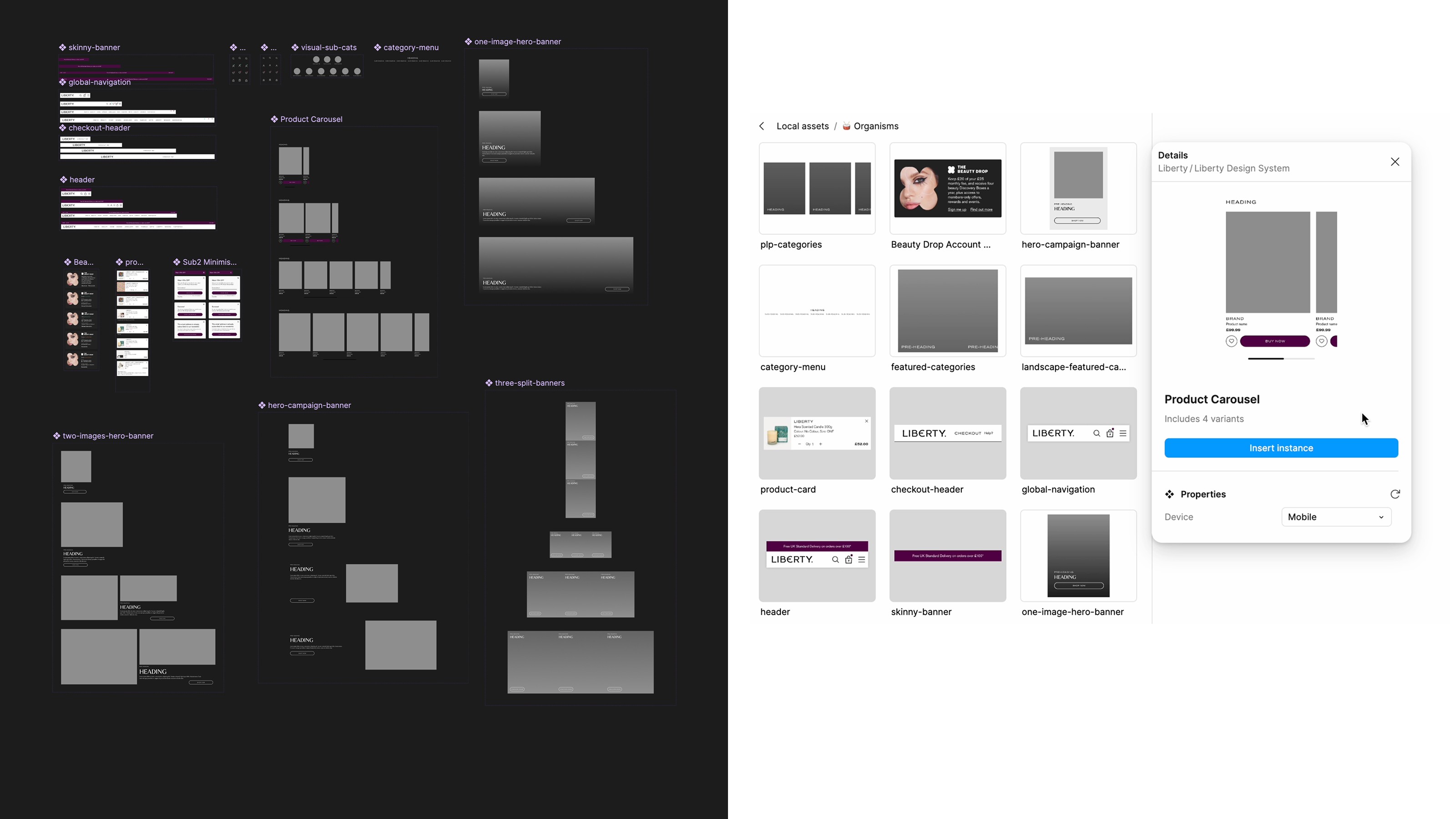
Reusable Layout Components
Larger building blocks like nav bars, product carousels, and hero banners were created as flexible organisms. These elements combine multiple components and support variant switching across devices.

Responsive Component Behaviour
Using constraints and variants, components respond to breakpoints from mobile to desktop. Navigation and content modules adapt fluidly, ensuring a consistent experience across screen sizes.
Reusable Component Library
A scalable library of 60+ reusable UI components, structured with variants and accessibility baked in to support consistent interfaces across flows.
Variants & Properties
Core components are structured with variants to handle size, type, and state. Properties make interaction logic visible and intuitive, streamlining handoff for developers and ensuring predictable behaviour.
Component Interactions
Interactive states such as hover, focus, and selection were prototyped in Figma to show behaviour clearly. Micro-interactions and transitions help communicate intent and improve UX clarity.
Accessibility
Components were designed with accessibility in mind from the start, including visible focus indicators, keyboard navigation, and high-contrast messaging. All new colours and labels meet or exceed WCAG AAA.
Reusable Layout Components
Larger building blocks like nav bars, product carousels, and hero banners were created as flexible organisms. These elements combine multiple components and support variant switching across devices.
Responsive Component Behaviour
Using constraints and variants, components respond to breakpoints from mobile to desktop. Navigation and content modules adapt fluidly, ensuring a consistent experience across screen sizes.
Phase 4
Adoption & Handoff
I drove adoption through onboarding materials, component documentation, and a live request board in Monday. Close collaboration with developers ensured naming and behaviour aligned for smoother implementation.

Asset Status Tagging
I introduced a tagging system in Figma so teams could instantly tell which components are ready, in progress, or need updating.

Design System Onboarding
Wrote clear onboarding copy and practical guidance inside the design file to help others understand how to use and contribute to the system confidently.
Dev Handoff Setup
Set up tokens, structure, and layout guidance in Figma’s inspect panel to make development handoff faster and less error-prone.
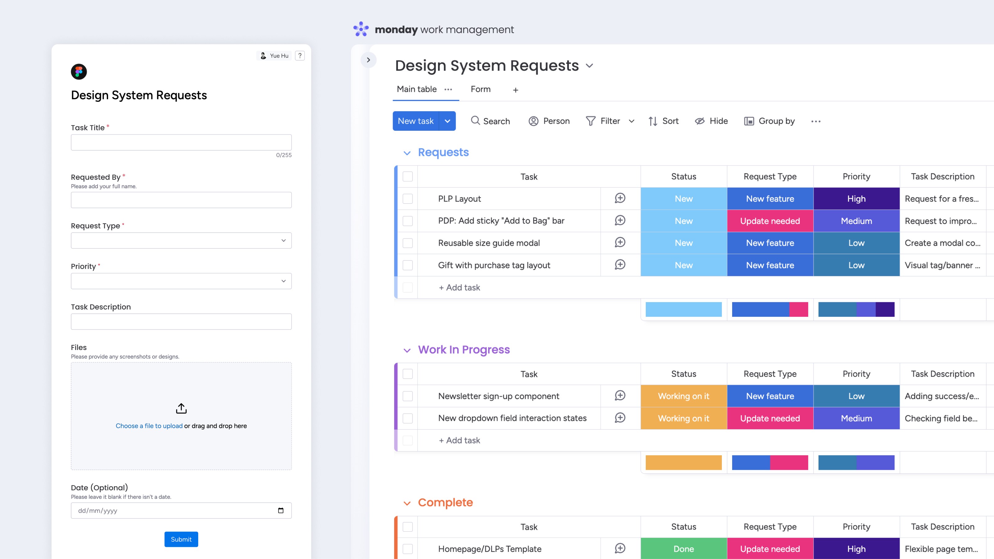
System Requests & Workflow
Created a request form and linked Monday board so the team could easily raise design needs and stay aligned on progress.
Asset Status Tagging
I introduced a tagging system in Figma so teams could instantly tell which components are ready, in progress, or need updating.
Design System Onboarding
Wrote clear onboarding copy and practical guidance inside the design file to help others understand how to use and contribute to the system confidently.
Dev Handoff Setup
Set up tokens, structure, and layout guidance in Figma’s inspect panel to make development handoff faster and less error-prone.
System Requests & Workflow
Created a request form and linked Monday board so the team could easily raise design needs and stay aligned on progress.
Impact
A benchmarked review of design workflows and developer collaboration validated the impact of the new system.
Reduction in Component Duplication
70%
Designers now use fewer, more consistent components.
Faster Design Workflow
25%
Reusable variants accelerated common flows.
Dev-Ready Architecture
100%
Token-ready structure improved implementation.
Next Steps
As adoption grows, I’ll continue supporting dev implementation, introducing tokens and coded components, improving accessibility, and managing the Monday board to prioritise future requests across platforms.