Vero Banking App

Vero is a mobile banking app built around a clean, intuitive interface that puts users first. It’s designed to make money management effortless, turning everyday banking into a simple and engaging experience.
From checking balances to transferring funds, every interaction is clear, fast, and frustration-free.
Product Designer
UI/UX Design
User Research
Prototyping
Visual Design
Design Systems
Brand Identity
Project Background
Banking apps often try to do everything at once, leaving users with cluttered screens and confusing navigation.
Goal
My aim was to create a streamlined experience that feels approachable and trustworthy, giving people the tools they need without adding unnecessary complexity.
Key Screens
The core screens in Vero are designed for clarity and speed, with each element carefully placed to reduce friction. Both light and dark modes have been considered from the start, ensuring comfort and usability in any environment.
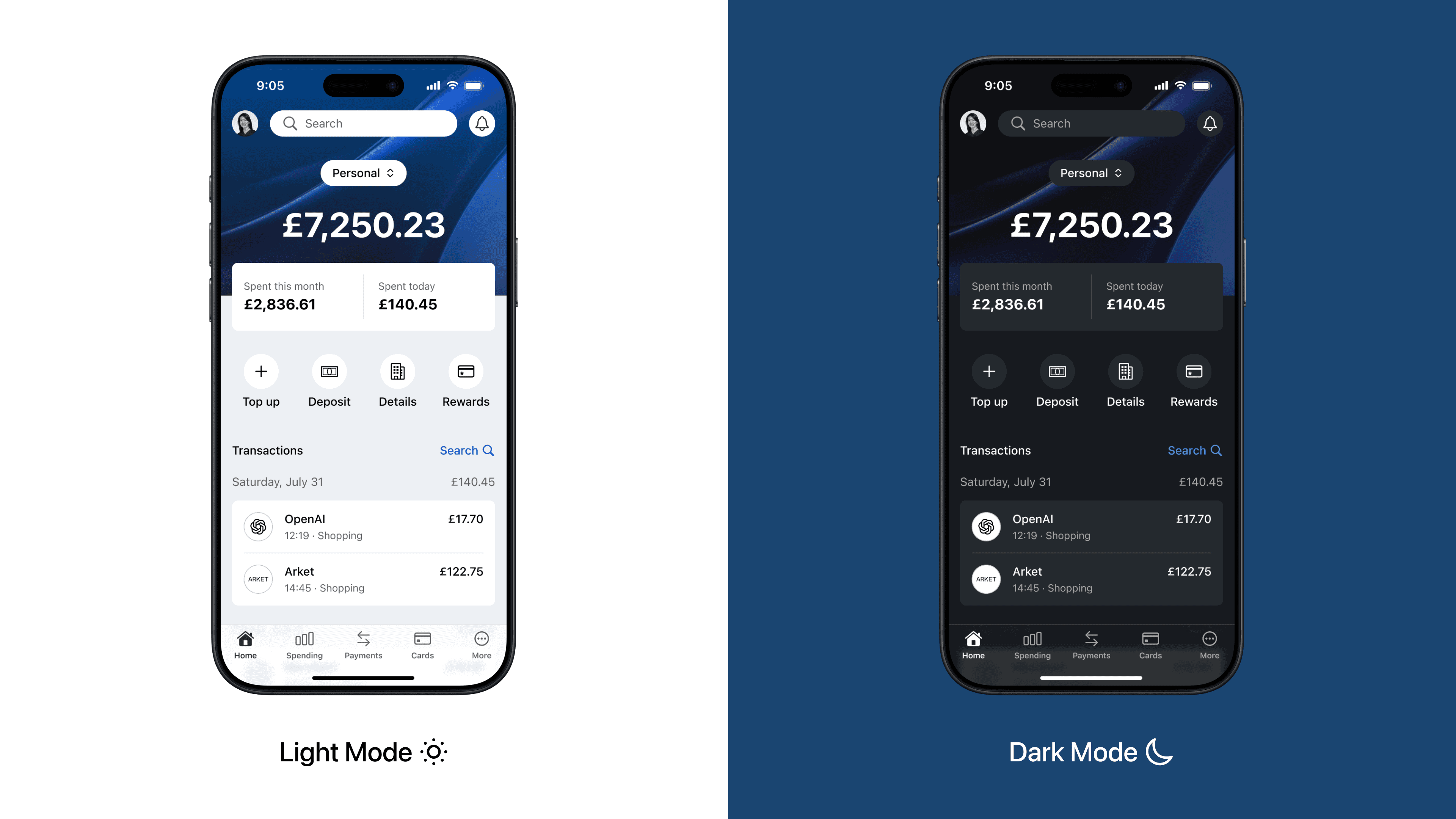
Home & Dashboard
The home screen delivers a clear snapshot of the user’s finances, featuring balance, recent spending, and quick actions in one view. The gradient header creates visual hierarchy, while large touch targets make navigation effortless.

Spending Overview
A clean, data driven layout visualises spending patterns without overwhelming the user. Category icons and colour cues create instant recognition, while the adjustable time range invites exploration and control.
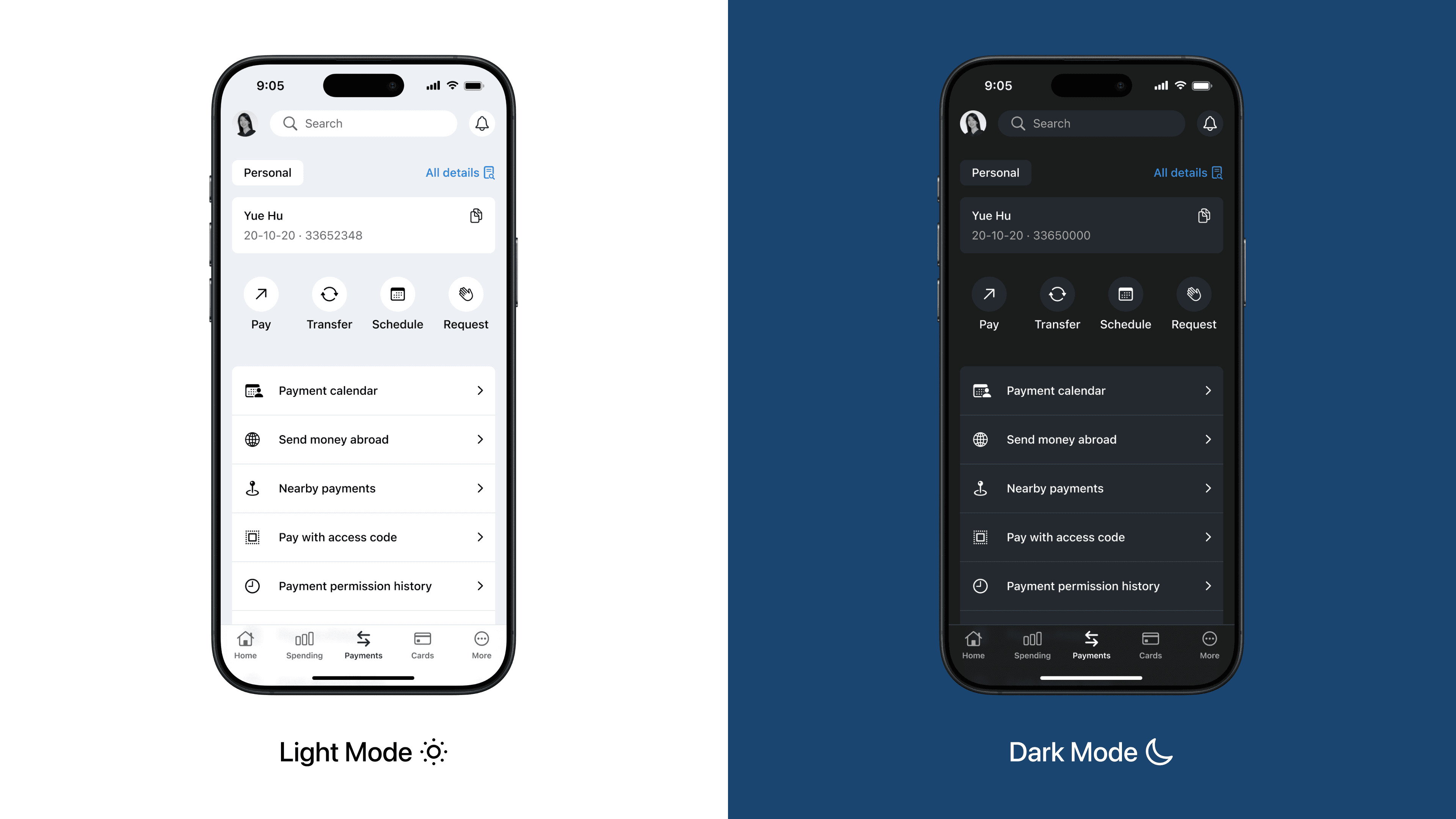
Payments Hub
All payment options are consolidated into a single, well structured view. Action buttons are grouped by intent, reducing decision fatigue and making frequent tasks such as transfers or scheduling quick and intuitive.
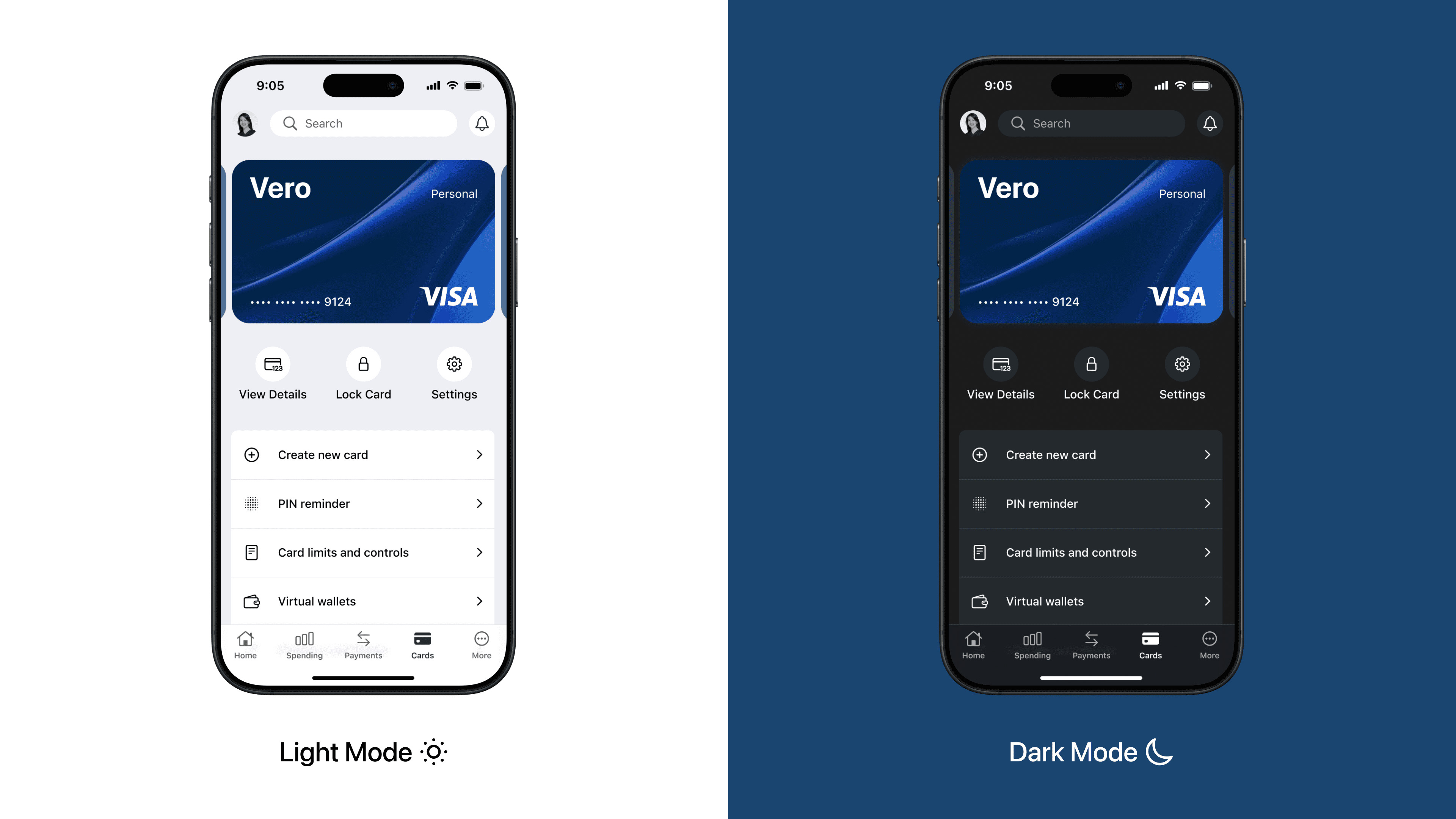
Cards & Security
This screen combines card management with security features in a clear, layered layout. The card design is prominent yet unobtrusive, while secondary options like PIN reminders and spending controls are accessible without clutter.
Reflection
Designing Vero from the ground up gave me the freedom to focus entirely on the user experience. It was a chance to explore how visual simplicity can build trust, especially in a financial context.
I learned that the smallest details such as button spacing, colour contrast, and typography can make a big difference in how confident and comfortable people feel when managing their money.